The original vision for the game was for it to be a 3D low-poly project with a minimalistic style. However I previously invisioned to be working with someone else to achieve this look, as 3D modelling a decent amount of plants would be a very time consuming process. So, as the project progressed onto a solo development game I wanted to re-think the art direction to something more realistic given the timeframe for the project.
Seeking Advice
I deceided to ask one of our industry speakers, who happens to be an art director, what she would do given the situation. Lucy gave me some fantastic advice on what to try and do with my game in terms of art direction in order to keep to the time frame while making it look nice.
- soft pallete
- strong sillouhetes
- block colour or gradients
- colour wise monument valley is a good idea to look at for colours
- pull away the detail and go for colour
- make sure things are distinct in shape so they are easily distinguishable
Note: yorkshire games festival had a relaxing garden game to look at
Keeping these reccomendations in mind I began creating some moodboards to better understand what styles would be achievable.
Artist Study
I began to look into one of the artists on the moodboard called Iraville, and I did an in-depth look into how she creates her watercolour nature-inspired illustrations.
You can find out more about that on my blog post: Iraville – Illustrator
Visual Case Studies
To get a better understanding of what the final product could look like in this style I took a look into other 2.5D games that used a hand-painted pallete. I wanted to understand how they had aproached the visuals and how they made the whole game look like one coherent piece.
Case Study 1
Game: Carto by Sunhead Games
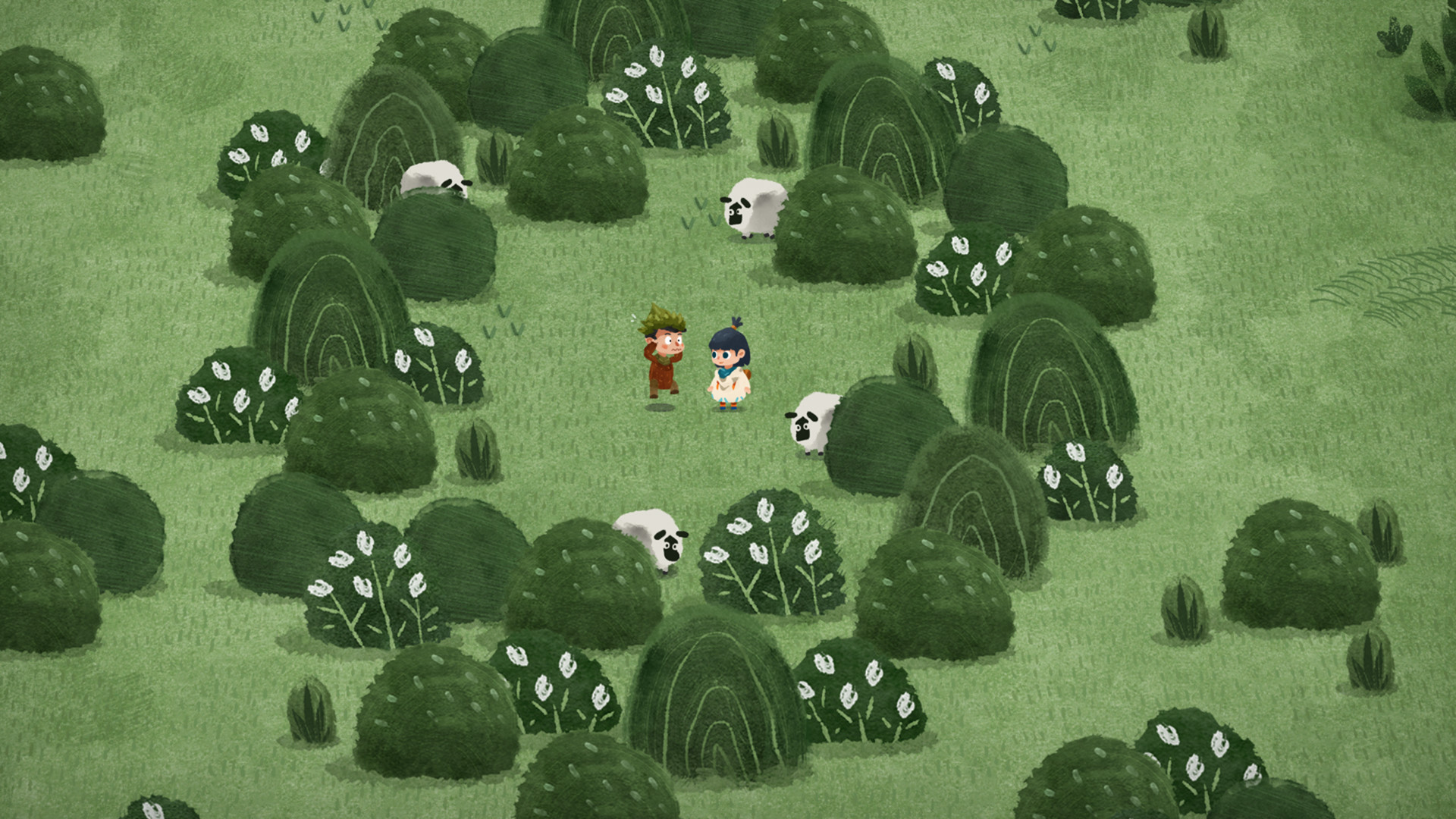

Carto is a 2.5D game, played in third person, exploring the environment while assembling a map. The art direction in this game is beautifully child-like and gives a homely, cosy feeling to the game. Despite the game being made up of mainly blue and green colours, they still appear warm because of the yellow undertones running throughout the game. Important items, characters and places stand out by having contrasting colours such as a red jumper or bright blue scarf.
Visually, Carto has managed to create a large amount of environment variation simply by using different simple shapes for plants, trees and bushes. This is something that has been repeated throughout this blog post so I really want to stick to it while creating the art for my game. Remember: simple, strong shapes.
Case Study 2
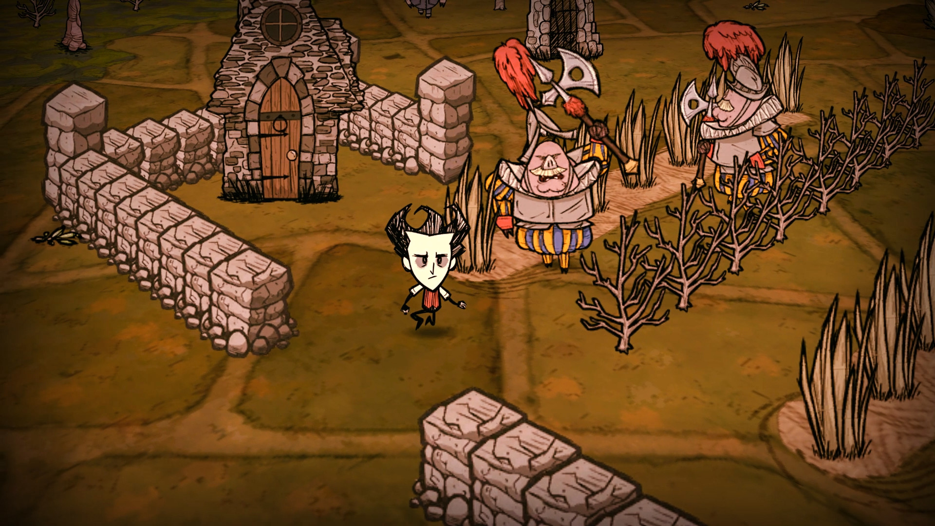
Game: Don’t Starve
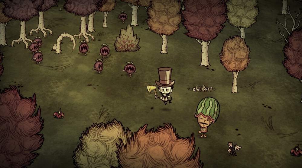
Dont starve is a 2.5D survival game that really takes you on a rollercoaster of emotions. The visual style of Don’t starve is an interesting one to look at because it drastically changes depending on the biome, time of day and season. Something they manage to do very well is convey to the player what sort of emotion they should be feeling: at times you feel creeped out by the visuals because they do such a good job of setting the mood. Visually they use lighting and animations to make those feelings come to life.
I also wanted to take a look at the building system for the game because I would like to include object placement and path creation in my garden game so players can fully customise their garden and make it feel like a home. Don’t starve uses an isometric style for placement objects such as walls and floor tiles, this means that when you rotate your view, the sprites always face the camera but the 3D worldspace changes orientation so you can see items that might’ve been behind other objects.
Another interesting artistic visual to note is that none of the static objects in Dont starve have a shadow. Instead they blend into the ground visually with small pieces of rock or grass. Moving characters or animals have shadows which makes them stand out from the envrionment.
Experimentation
Current visual style: 2.5D, 45 degree camera angle, with a watercolour environment.
I began experimenting with this style to better understand some of the technicallities of working in this way.
I watched a variety of videos to help me to better understand what 2.5D is and how it works. I now understand a lot more about how 2.5D games are made up of 2D shapes and how those shapes work technically with hitboxes. Its a useful thing to understand because it does change how I create the assets to work well with hitboxes: for example I dont want the player to be able to place plants so close to each other that they look like they are colliding as it ruins the illusion that the visual style creates.
I began with a simple 2.5D asset test in unity which bought about some early signs of problems.
- There was a slight issue with the 2D sprites clipping through each other when placed too close
- The flat, cut-off lines at the bottom of the plants makes them look seperate from the envrionment
- Creating shadows underneeth the plants is hard because of the clipping issue
These issues are great to be aware of this early in the design process because I can change my visual style to better accomodate issues like shadows not working the correct way.

I noted the issues on the 2D sprites so I know what to improve on.

